Responsive attorney website design is no longer a feature — it is an absolute baseline requirement for any law firm that wants to compete online. With over 63% of legal searches now occurring on mobile devices, and Google using mobile-first indexing as its primary ranking methodology, a website that is not fully responsive is actively losing more than half of its potential clients before they even read a word of your content.
Importance of Mobile-Friendly Design
Google moved to mobile-first indexing in 2020, meaning it now primarily uses the mobile version of your site for ranking purposes. A non-responsive attorney website design will rank significantly lower in search results — regardless of how exceptional your desktop experience is. In practical terms, this means every competitor with a responsive site has an inherent SEO advantage over non-responsive sites, before either has written a single blog post or built a single backlink.
Beyond SEO, the behavioral case for responsive attorney website design is equally compelling. Mobile users searching for attorneys are often in urgent, emotionally heightened situations — they may have just been in an accident, received legal papers, or been arrested. They need help immediately. If your site is frustrating to navigate on their phone, they will not wait for a better experience — they will call the next firm on the list. In the legal industry, speed of contact is often the deciding factor in client retention.
"We rebuilt a Dallas DWI defense firm's website with a mobile-first responsive attorney website design. Their mobile call conversion rate improved by 280% within 60 days of launch."
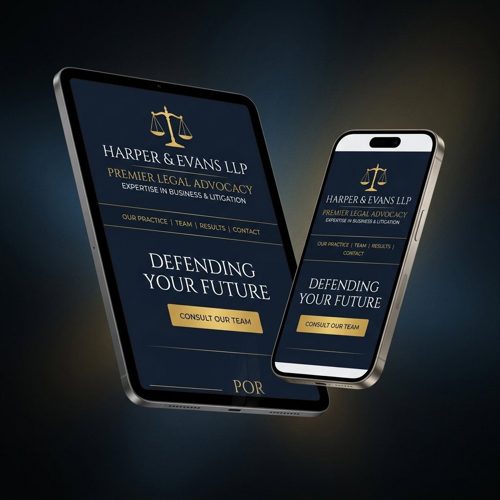
Best Responsive Layouts
The most effective responsive attorney website design layouts follow a mobile-first development approach: design and code the mobile experience first, then progressively enhance for tablet and desktop breakpoints. For law firms, this means a single-column layout on mobile that expands to two or three columns on larger screens. The hero section stacks vertically on mobile — headline, subheadline, then a full-width click-to-call CTA button. Navigation collapses into a hamburger menu accessible from the upper right corner.
Key layout patterns for responsive law firm sites include: stacked attorney bio cards on mobile that become a horizontal grid on desktop, a single-column Q&A FAQ section that needs no horizontal layout changes, a compact mobile contact form where each field occupies a full-width row, and a simplified mobile footer that prioritizes the click-to-call button above all other links.
Tools for Testing Responsiveness
Once your responsive attorney website design is built, rigorous cross-device testing is essential before launch and after any significant update.
Mobile Navigation
Mobile navigation for responsive attorney websites must be touch-optimized and simplified. The hamburger menu icon should provide a minimum 44×44px touch target area — larger than the icon itself if necessary. Never implement dropdown submenus on mobile — they are nearly impossible to operate with a thumb and will cause immediate frustration. Instead, expand the hamburger menu into a full-screen navigation overlay with large, clearly spaced touch targets for each primary page. Include a prominent "Schedule Consultation" button as the last item, styled distinctly from the navigation links.
Flexible Grids
CSS Grid and Flexbox are the technical foundation of modern responsive attorney website design. Use percentage-based widths for all layout containers rather than fixed pixel values. Set max-width constraints on content areas (typically 1200-1400px) to prevent content from becoming unreadably wide on large monitors. Use the CSS clamp() function for headings: clamp(24px, 4vw, 48px) ensures font sizes scale proportionally across all device widths without requiring multiple breakpoint overrides.
Touch-Friendly Buttons
All interactive elements on a responsive attorney website design must meet minimum touch target standards. Apple recommends 44×44px; Google recommends 48×48px. For attorney contact forms, this means generously sized input fields with sufficient padding that a thumb can accurately tap without mis-selecting adjacent elements. Your primary CTA button should be 100% width on mobile — a full-width block element that is impossible to miss and easy to tap from any thumb position.
A fully responsive attorney website design is the non-negotiable foundation upon which all other digital marketing efforts are built. Without it, no amount of SEO investment, PPC spending, or content marketing will achieve its full potential. Get our free mobile audit to see exactly how your current site performs on the devices your clients are actually using.