Lawyer website UX design — the discipline of creating digital experiences optimized for how users actually think, feel, and behave — is the most underutilized competitive advantage in legal marketing today. While most law firms focus on aesthetics and keyword rankings, the firms that consistently dominate their markets invest deeply in understanding the specific psychological state of their website visitors and designing every element to meet those visitors where they are emotionally.
Understanding User Behavior
The person landing on your law firm website is rarely in a relaxed, rational, comparison-shopping mindset. They are typically stressed, scared, facing a life-changing legal situation, and looking desperately for someone they can trust. Effective lawyer website UX design acknowledges this emotional state immediately and designs the entire experience around it.
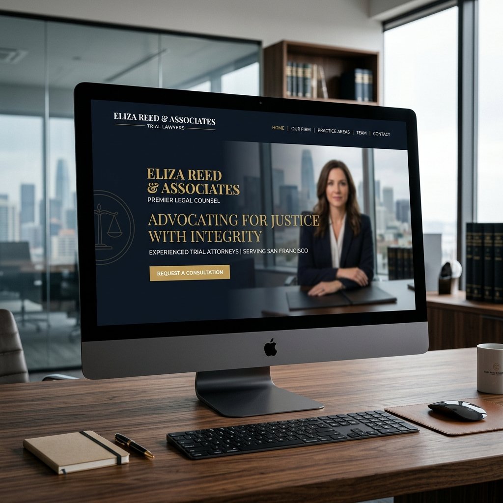
Your hero section should address the visitor's anxiety before introducing your credentials. Lead with empathy: "We understand how overwhelming this situation feels" resonates more powerfully than "25 years of experience" in the critical first 15 seconds of the visit. Eye-tracking studies show that on attorney websites, visitors look first at the headline (for relevance), then the attorney photo (for trust), then the CTA (for next step). Design your hero section to satisfy these three sequential needs in order.
"The fundamental insight of great lawyer website UX design is this: your visitor is not shopping for a lawyer. They are desperately searching for relief from a problem. Design for that — not for your ego."
Improving Navigation
Navigation in lawyer website UX design must be ruthlessly prioritized around two goals: getting users to their relevant practice area page, and getting users to the contact page. Research on attorney website behavioral patterns shows that 85% of visitors who do not find their specific legal problem addressed within the navigation's visible items will leave the site without making contact. Structure navigation around client problems, not attorney credentials.
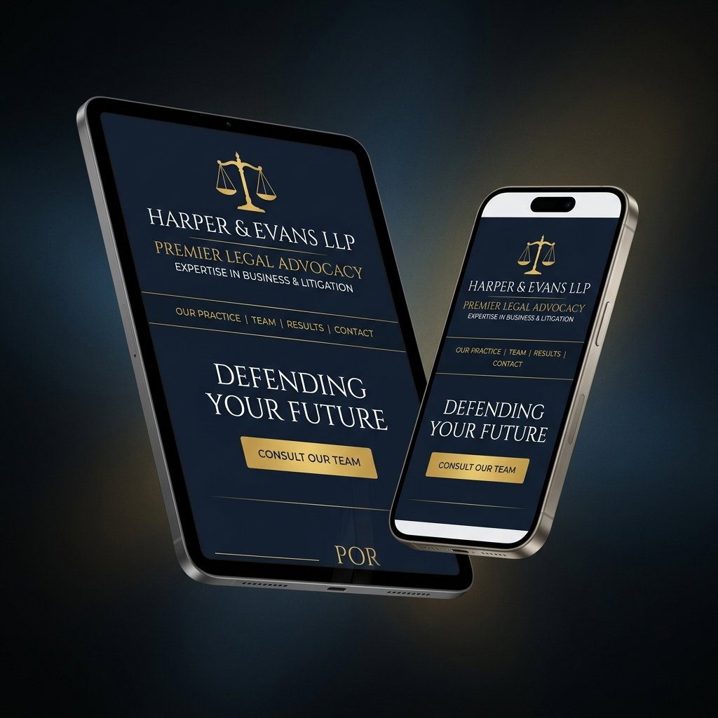
Limit primary navigation to 5–7 items maximum. Use clear, problem-specific labels — "Car Accident Injuries," "Criminal Charges," "Divorce & Custody" — rather than generic legal category names. Include a visually distinct "Free Consultation" or "Contact" CTA at the far right of the navbar, styled as a button with a contrasting color, so it is never confused with a navigation item.
Designing for Accessibility
Web accessibility is both an ethical obligation and a direct business advantage in lawyer website UX design. Law firms face above-average accessibility scrutiny because of their public-service role and because potential clients include elderly and disabled individuals who disproportionately need legal services. ADA-compliant websites also tend to perform better in SEO, load faster, and convert more efficiently across all user types.
Simple Menus
Lawyer website navigation menus must pass the "stranger test": a person who has never seen your firm should be able to understand exactly what you do and find what they need within 5 seconds of looking at your navigation. Avoid clever menu labels, nested dropdown submenus on mobile, and excessive categorization. Every navigation item should represent a meaningful destination for a real user with a real legal need.
Readable Fonts
Reading comfort is a critical but frequently violated principle in lawyer website UX design. Body text should be a minimum of 16px on desktop, with 18px preferred for maximum readability without scrolling. Line height should be 1.7–1.9 times the font size. Line length should be 65–80 characters for optimal reading speed and comprehension. Contrast ratio between text and background must be at least 4.5:1 (WCAG AA) — pure black on white passes; light gray on white does not.
Accessibility Standards
ADA and WCAG 2.1 compliance requires specific technical implementation in your lawyer website UX design. Key requirements include: sufficient color contrast (4.5:1 minimum for normal text, 3:1 for large text), alt text for all non-decorative images, keyboard navigation support for all interactive elements, ARIA labels for form fields and icon-only buttons, focus indicators visible on all interactive elements, and captions or transcripts for all video content. Use the WAVE or axe DevTools accessibility checker to audit your site and address all flagged issues before launch.
Investing in superior lawyer website UX design does not just help users — it directly improves your firm's business outcomes. Every UX improvement that reduces friction on the path to consultation generates measurable, trackable additional revenue. Talk to our UX team about a free visitor behavior analysis of your current site.